Instagram treats its text zones differently, and the difference decides where fancy fonts help you and where they quietly cost you reach. The Name and Bio are display-first — styles shine there. Captions and hashtags are retrieval-first — plain characters win.
This guide maps the three zones, then walks through a bio layout that keeps the pretty AND the searchable.
The three text zones
| Zone | Limit | Fancy fonts | Watch out |
|---|---|---|---|
| Name (display) | 30 characters | ✅ The best stage | Search matches exact characters |
| Bio | 150 characters | ✅ Styles + line breaks | Combining marks can misalign in IG's font |
| Captions | 2,200 characters | ⚠️ OK for a word | Hashtags inside captions must stay plain |
| @username | 30 characters | ❌ Never | Plain characters only, always |
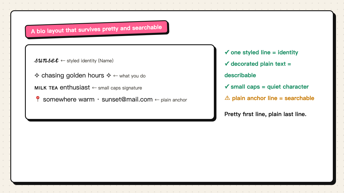
A bio layout that works
The layout above balances pretty and findable: the display name carries the style (𝓈𝓊𝓃𝓈ℯ𝓉), the first bio line states what you do in decorated plain text, small caps add a quiet signature line, and the last line keeps location or contact in ordinary characters.
The plain-text rule matters more than it looks: IG search and tag pages match ordinary characters, so one plain line in the bio keeps you discoverable while everything else stays styled.
Limits and the lookup trade-off
- Name: 30 characters, and decorations count — a double frame eats 4 of them.
- Bio: 150 characters; use line breaks instead of symbol walls for structure.
- Whole-glyph styles (script, fullwidth, small caps) survive IG's rendering better than combining-mark styles like strikethrough.
- After saving, search your own plain name once — if it fails, add the plain spelling to the bio.